
Tuesday, December 13, 2011
Tuesday, December 6, 2011
process project 2
Using my honeycomb designs as a starting point, my initial concept is to use the hexagon shape at a variety of scales dispersed along a linear datum. Opaqueness, translucency, and transparency are important for my design and I intend to explore how these can interact with the space and the composition in a manner that is consistent and improves upon that from the base model. Ultimately, I want at least three major scales of forms derived from the honeycomb, one at a small scale that could be viewed as a pattern/texture, a larger scale as an object, and then as a space. The hexagon form lends itself well to all three scales and provides enough variety for the creation of an intriguing space.
The methodology I would like to adhere to is the use of my form as a significant element for major components, but not to the extent that every element would be designed as a hexagon/honeycomb. I want to maintain the space as not only inhabitable, but also dynamic.
I intend to use Form Z for baseline modeling, and the Adobe suite for post-processing and composition development.


Tuesday, November 29, 2011

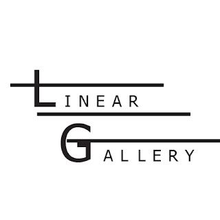
Logos
My intent in designing logos for the linear gallery was to create mostly minimalist compositions that focused on either the linear or the spatial aspect of the gallery, with a large focus being on the text "linear gallery". I chose to only use black, white, and a shade of gray in my designs because I felt it challenged me to focus on the interaction of the positive and negative space in the composition of each design. I also felt that relying on color would be less effective were the logo to ever be printed in black and white. I have arranged the final composition of the iterations on a 6"x 6" grid with each logo centered in their respective block. I chose four images, which are at double scale, to fill the remainder of the grid spaces. These images were selected because I felt that they were some of the more successful designs and that they help organize the page into what I believe is a more aesthetically pleasing composition.


Monday, November 28, 2011
Comment Points Opportunity - Get them while they're hot!!!
Current iterations of logos. Any feedback would be appreciated.


Sunday, November 27, 2011


Tuesday, November 22, 2011
Digital Fabrication
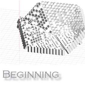
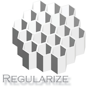
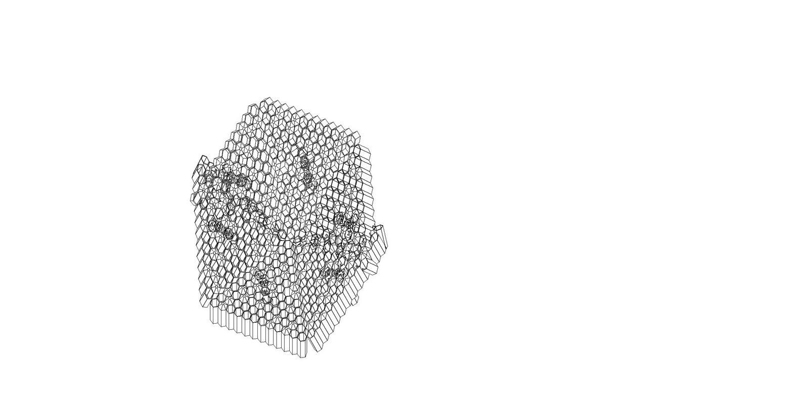
My intent for this project was to take the honeycomb model and explore the possibilities presented by the form's pattern and the ways the form could be manipulated for transparency. I chose to isolate a small hexagonal pattern and regularize it and then slice it. After evaluation I chose to use only several slices through the model and leave a separation between them to really emphasize the way the pattern can be overlapped and the effects of light through the form. Additionally, the guiding principle of the design of the model is the hexagonal form, which is utilized in the smaller units, composed into a larger hexagonal whole, and intersected by a hexagonal framing system.


Thursday, November 10, 2011


Friday, November 4, 2011
Midterm

Thursday, November 3, 2011
Portfolio and resume
My intention for this project was to set up a graphic system based on a grid that allowed me to compose spreads of both single compositions and of multiple images relating to one project. The portfolio is set up at 8" x 8" and the grid has been modified for two different layouts that maintain a similar system to each other. 1/2" margins would allow for the portfolio to be bound, likely 1/4" spiral-bound. On the single image spreads, I intended for the layout to be a simplified version of the grid that provided just what was needed for the image, some accompanying text, and the title portion. For the project spreads, my intent was for one or two key images to be located at the top of the page and supporting smaller images below, but as I demonstrate on page 4 that system can be broken while still adhering to the grid. I have posted two versions of the resume as well, one set up for the back of the portfolio at 8"x8", which adheres to the graphic system strongly; and another at letter size that is more lenient with the grid.


Subscribe to:
Posts (Atom)