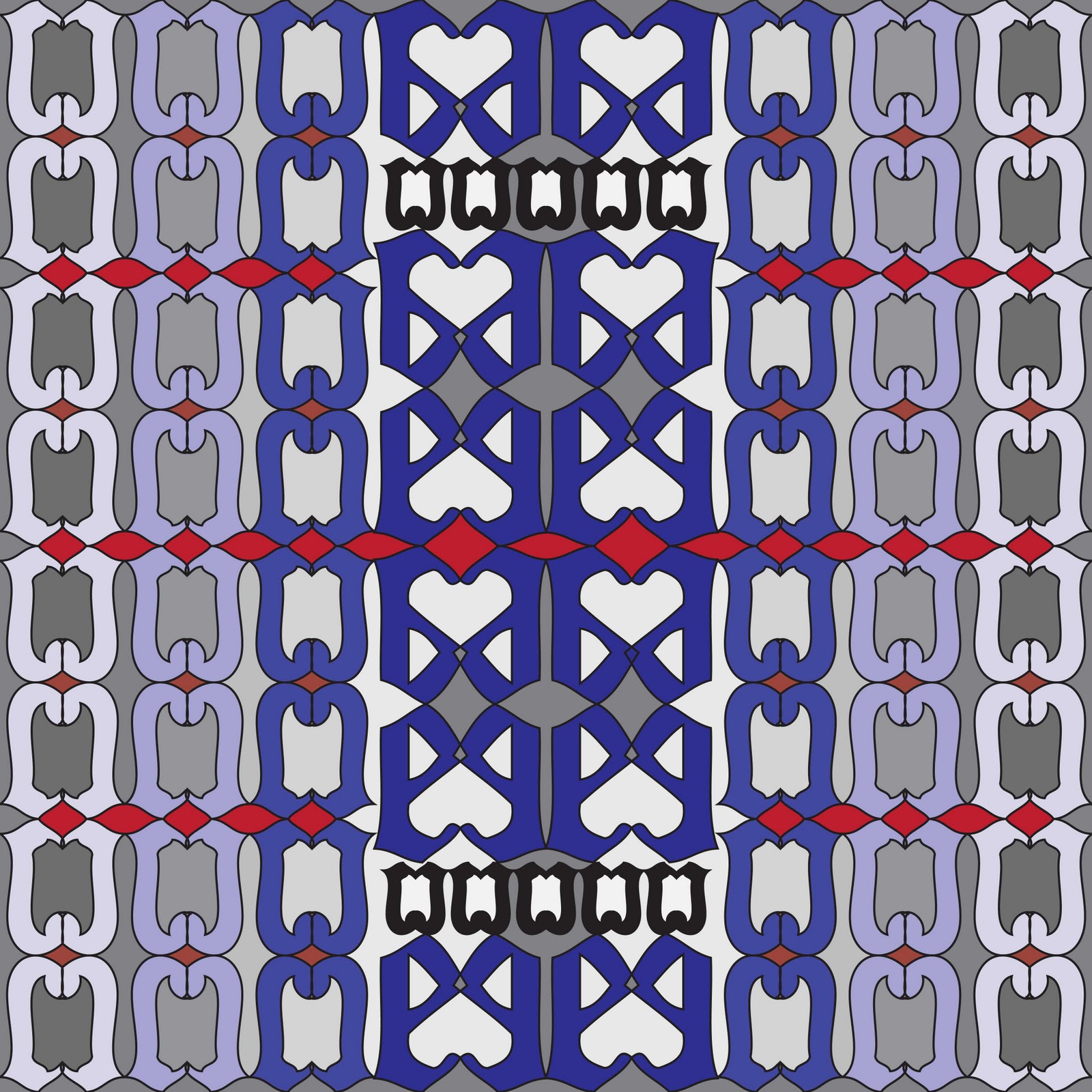
For this assignment I went through several different composition ideas as part of my process and have posted them here. Composition number one and number two were an evaluation of how the diagonals in the gothic font can be used to set up a series of regulating lines that shape the other letters. The role of these lines is expressed through a repeated pattern where each letter is scaled from the edge of the page to the intersection of another diagonal (“vanishing point”). Numbers three and four were part of my process for five and six. All four of these compositions attempt to highlight the horizontal datum established in the text by each character’s apex and terminal element, shown using the “C” and “E”. Additionally, the relation of the positive and negative space created by reflecting the letters upon themselves is also a part of the study and is shown most strongly in the color compositions that play contrasting colors against each other to show this relationship.

1.

2.

3.

4.

5.
6.
No comments:
Post a Comment