
Tuesday, November 29, 2011

Logos
My intent in designing logos for the linear gallery was to create mostly minimalist compositions that focused on either the linear or the spatial aspect of the gallery, with a large focus being on the text "linear gallery". I chose to only use black, white, and a shade of gray in my designs because I felt it challenged me to focus on the interaction of the positive and negative space in the composition of each design. I also felt that relying on color would be less effective were the logo to ever be printed in black and white. I have arranged the final composition of the iterations on a 6"x 6" grid with each logo centered in their respective block. I chose four images, which are at double scale, to fill the remainder of the grid spaces. These images were selected because I felt that they were some of the more successful designs and that they help organize the page into what I believe is a more aesthetically pleasing composition.


Monday, November 28, 2011
Comment Points Opportunity - Get them while they're hot!!!
Current iterations of logos. Any feedback would be appreciated.




Sunday, November 27, 2011


Tuesday, November 22, 2011
Digital Fabrication
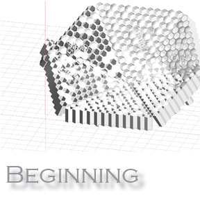
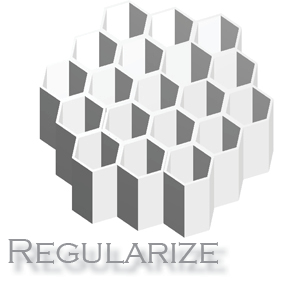
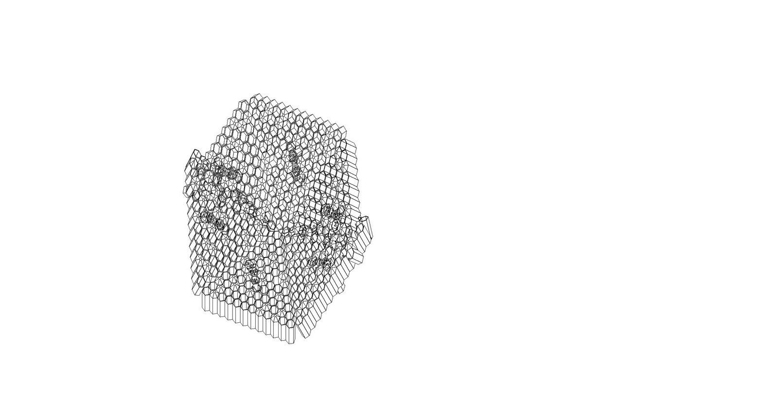
My intent for this project was to take the honeycomb model and explore the possibilities presented by the form's pattern and the ways the form could be manipulated for transparency. I chose to isolate a small hexagonal pattern and regularize it and then slice it. After evaluation I chose to use only several slices through the model and leave a separation between them to really emphasize the way the pattern can be overlapped and the effects of light through the form. Additionally, the guiding principle of the design of the model is the hexagonal form, which is utilized in the smaller units, composed into a larger hexagonal whole, and intersected by a hexagonal framing system.



Thursday, November 10, 2011



Friday, November 4, 2011
Midterm

Subscribe to:
Posts (Atom)