Thursday, October 27, 2011

Gallery

My intent on board one was just to show the orthographic drawings in such as way that they clearly relate to one another and that emphasized the axonometric drawing as that provides the easiest read of the space. On the second board, my intent was to express the existence of the bay within a linear space. This was shown by repeating the units in hidden line and plan in a perspective view. Additionally, I removed one of the columns from the main perspective in order to show the rest of the space better and made the edges transparent to emphasize its relation to the whole. Additionally, I took several images from and of our gallery spaces and arranged them in a collage to show the use of the space. A second perspective of the model also shows my representation of this.


Tuesday, October 11, 2011

project 6


My intent for this project was to take the information gained from our previous review and integrate it into a new composition. In order to achieve greater balance, I modified my model some in Form Z and adjusted some of the material properties. I also revised the lighting and created new perspective views. The final composition now shows two large perspectives; one that gives the impression of being in the space at a large scale and another, which has been faded out into the background slightly, that relates to the first image and strengthens the hierarchy by emphasizing the “stepping” from each letter. I use these perspectives as my main image, and incorporate the original text, the original patters, and the new plan into the image as a whole. Additionally, an axonometric view of the model is located in the top right corner in a way that still relates to the composition but has a sense of individuality. A portion of the axon is presented in wireframe, showing the structure that makes up each letter; before converting directly to the rendered version, a hybrid strand of the font is also added. Lastly, the letters which were used in my pattern and the steps that led to the pattern’s creation are expressed in the page border.


Tuesday, October 4, 2011

Project 5


My intention in this representation exercise was to create a composition that reflected the integration and thought process that occurred during the transition from the original text to the 2d pattern, and finally to the 3d model. The first layer of the drawing is the perspective image of the final 3d model. I chose to place this first because it is the main subject of the composition. The perspective view emphasizes the hierarchy of the objects used in the model (which reflected the hierarchy in the pattern). The next layer shows the process the led to the development of the pattern, starting at the top with the original text, which the isolates the letters from the pattern and shows how it evolved. Below the original text a plan view and an isometric view of the model are shown to express the pattern/model as a whole. The 2d source image is the third layer of the composition and reads from top to bottom, progressing from the line drawing to the color drawing and ending at the perspective of the model. To balance this and express the lines that form the model, the lower right hand side of the perspective is in hidden line form and phases into the fully rendered version. My intent with leaving the red datum colored in this version is to show the importance of that element as well as to provide a greater sense of continuity to the image.


Tuesday, September 27, 2011

Project 4


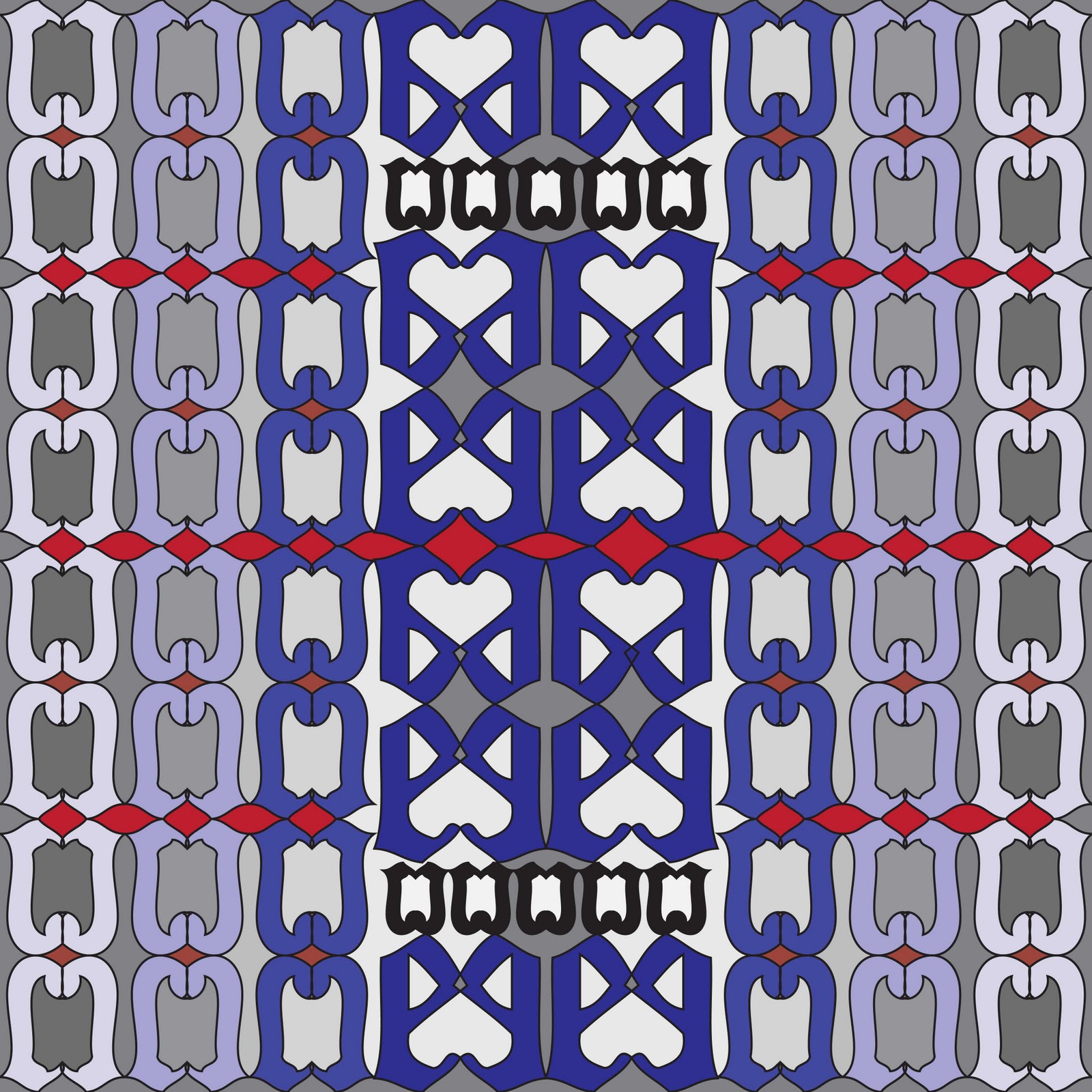
My intent in translating the 2d pattern into a 3d form was to stay true to the hierarchy of spaces set forth in the pattern, which characterized important aspects of the letters; notably the horizontal datum derived from the negative space in-between reflected versions of each form, and the hierarchy of scale towards the center as one examines the pattern. To this end, the red horizontal datum is significantly more extruded then the remaining shapes and creates a strong horizontal axis within the 3d form. The larger scale “e”’s are the next most prominent figure, with the smaller “c” letters stepping up towards them. The minor horizontal datum created from the voids around the “c” letters is extruded slightly higher than them to give it the prominence it help in the original pattern.  The 3d model was constructed by first building the core “T” shape, and then mirroring that upon itself.  This central element remained solid to give it appropriate hierarchy, and the iterations on either side have been made translucent to emphasize the core, as well as providing a strong visibility of the horizontal datum when the form is viewed from the axonometric angle. The orthographic view was selected because it clearly shows the letters stepping up in their respective orders of hierarchy, set against the horizontal datum as a backdrop. Additionally, the changes in density strengthen the repetition in the model.


Tuesday, September 20, 2011


For this assignment I went through several different composition ideas as part of my process and have posted them here.  Composition number one and number two were an evaluation of how the diagonals in the gothic font can be used to set up a series of regulating lines that shape the other letters. The role of these lines is expressed through a repeated pattern where each letter is scaled from the edge of the page to the intersection of another diagonal (“vanishing point”). Numbers three and four were part of my process for five and six. All four of these compositions attempt to highlight the horizontal datum established in the text by each character’s apex and terminal element, shown using the “C” and “E”. Additionally, the relation of the positive and negative space created by reflecting the letters upon themselves is also a part of the study and is shown most strongly in the color compositions that play contrasting colors against each other to show this relationship.

1.

2.

3.

4.

5.

6.

Tuesday, September 13, 2011

Project 2


Project Two Intent:
                On board number one (Grand Marnier) I attempted to express the similar shapes that repeat throughout the font and define the curves within the font. The letter “a” has a void that defines the space between the ear and the hairline; the form of this shape is replicated with a slight modification on the terminal of the letter “e”. The similarity between these positive and negative spaces can best be seen by connecting each letter with a rotated version of itself. The curve of the “a” shapes the “G”’s lower bowl; and the “e” shapes the curves on most of the other letters in the example text. On board number two (ecstacity), one of the defining qualities of the font is that two angles determine the slopes of each letter with an applicable diagonal component. The letters “s”, “l”, and “t” are on the steeper slope; and the letters “e” and “y” are on the gentler slope. Both boards also relate to each other by using the same technique to identify several other qualities of each font. The Gothic fonts have triangular terminals and apexes, the varying forms of each font are enlarged and placed in a repeating pattern along the top and bottom of the boards. The tracking/kerning of each font is expressed by a gradient that darkens in the negative space between each letter of the original translucent text in the background of the image. The consistency of each apex and terminal element is also shown using horizontal lines extending over the length of the image. Lastly, key parts of each font’s “anatomy” are also highlighted on the background text of each board. By analyzing both of these fonts in such a manner, my intent has been to express both the defining elements that appear to shape the characters of each font, as well as different characteristics of the final product that relate to the experience of reading the text.